Gardenful field guide
How to choose a garden color scheme
The short answer
A garden color scheme has to work with the colors that remain when nothing is blooming. Start with the house, paving, fence, and evergreen foliage. Choose one main flower color, one supporting color, and a quieter foliage neutral. Repeat them in visible groups, then check the bed without flowers. A good palette stays clear because its proportions and structure work—not because every bloom matches.
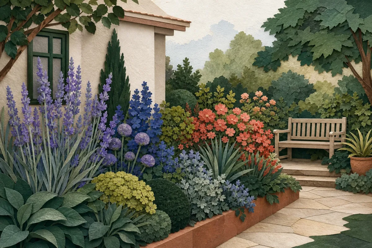
Begin with the colors that are already there
The garden is not a blank canvas. Photograph it from the main viewing point and make a short inventory before looking at flower photos.
- 1
1
Fixed materials
House, paving, fence, containers
- 2
2
Foliage field
The colors present for the longest season
- 3
3
Flower accents
One lead color and one supporting relationship
Result
A palette anchored to the place
The flowers change, while the composition still belongs to the house.
Make the palette usable
Record the house and hardscape: Name the undertone of brick, siding, stone, paving, and fencing. Warm terracotta, cool gray, creamy white, and blue-gray each create a different starting point.
Count the lasting foliage: Notice how much deep green, blue-green, silver, burgundy, or chartreuse remains beyond bloom. Foliage often occupies more of the view than petals do.
Choose the mood, not a shopping list: Decide whether the view should feel quiet, soft, lively, or graphic. That decision helps you reject attractive colors that do not serve the whole composition.
Test the palette beside the house material
House color does not dictate the flowers. It changes which contrasts feel quiet, lively, heavy, or hard to see, so review the planting and facade in the same frame.
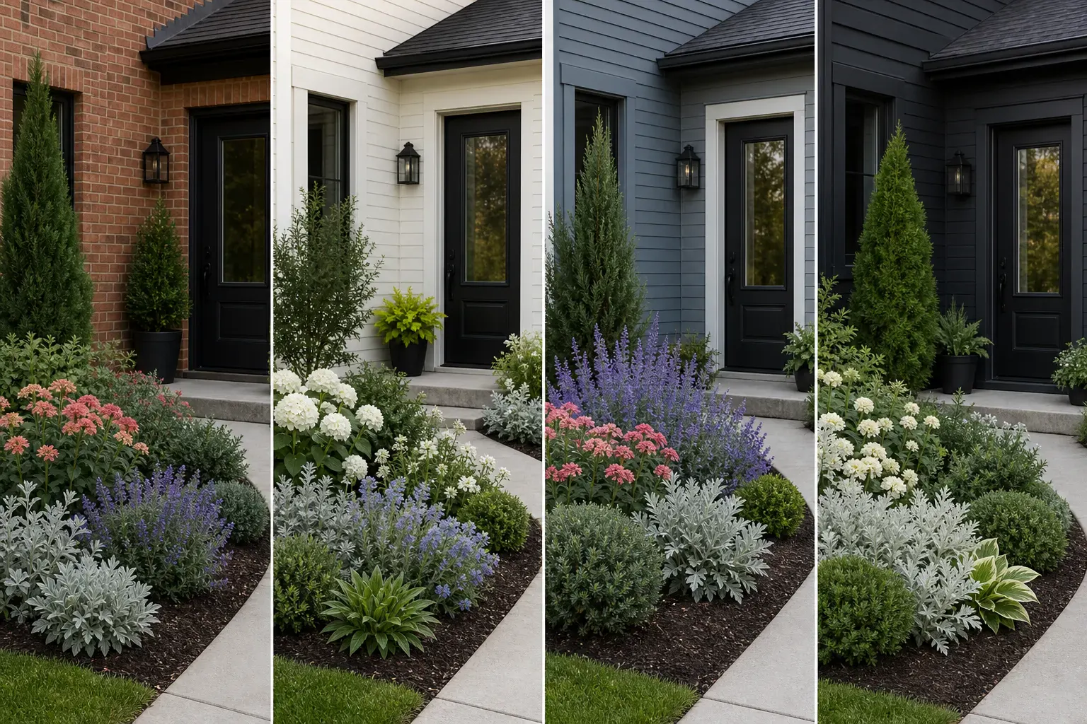
Warm brick or terracotta
- Useful palette direction
- Deep green and silver or gray-green foliage with one warm lead color and a smaller blue-violet counterpoint.
- Watch for
- Too many equal red, orange, and yellow flowers can merge into the masonry and make the entry feel busy.
- View test
- Step back far enough to see brick, door, path, and the whole bed together.
Cream or white siding
- Useful palette direction
- Deep green structure with white, soft blue, or one restrained warm accent; chartreuse can mark the entry.
- Watch for
- White flowers may become the brightest focal point at dusk rather than behaving like a neutral.
- View test
- Review midday glare and the evening view separately.
Cool gray or blue siding
- Useful palette direction
- Blue-violet and silver foliage for calm, or a measured coral accent for deliberate contrast.
- Watch for
- A fully cool palette can flatten in shade if foliage values and textures are too similar.
- View test
- Check whether the flowers remain visible against the wall in the site's actual light.
Dark siding
- Useful palette direction
- Luminous pale foliage, white flowers, and clear mid-green or evergreen structure that stays visible against the facade.
- Watch for
- Deep burgundy and dark green can disappear into one field when the bed is shaded.
- View test
- Photograph the bed from the main approach in morning and evening light.
Sources: Mississippi State University Extension, Oklahoma State University Extension
Choose one simple color relationship
You do not need a color wheel in the garden. These three relationships are practical ways to limit the palette while leaving room for plant availability and seasonal change.
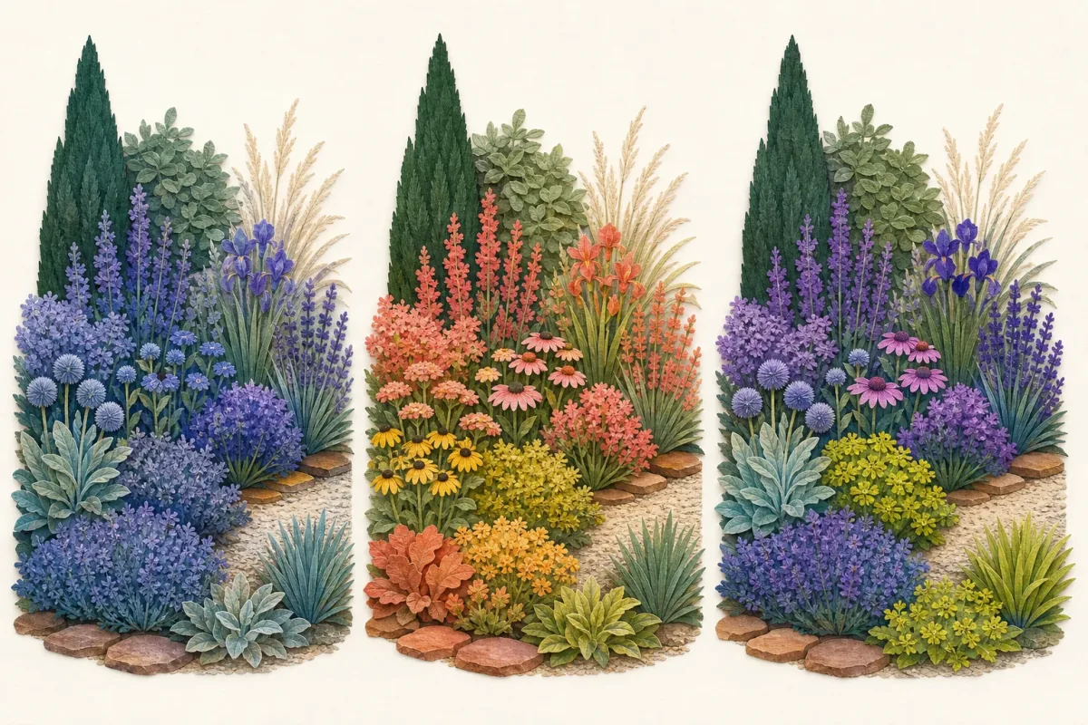
Monochromatic
- Effect
- A quiet view using tints and shades of one main hue.
- How to keep it coherent
- Rely on leaf shape, plant form, and light-to-dark contrast so the bed does not flatten.
- Check
- Whether the selected plants actually overlap in bloom.
Analogous
- Effect
- A soft transition among neighboring colors, such as violet, blue, and blue-green.
- How to keep it coherent
- Let one color lead and use the others in smaller repeated groups.
- Check
- Whether the house undertone supports the temperature of the palette.
Complementary
- Effect
- A lively focal area using colors from opposite sides of the wheel.
- How to keep it coherent
- Use the brighter color sparingly and give the eye enough green or neutral space.
- Check
- How intense the pairing looks in direct sun and from a distance.
White is not visually neutral in a dark planting. It can become the brightest point in the bed, especially at dusk.
Sources: Mississippi State University Extension, University of Georgia Cooperative Extension
Turn the palette into visible proportions
A palette becomes a garden when the colors occupy intentional amounts of space. Use broad foliage as the field and flowers as repeated signals.
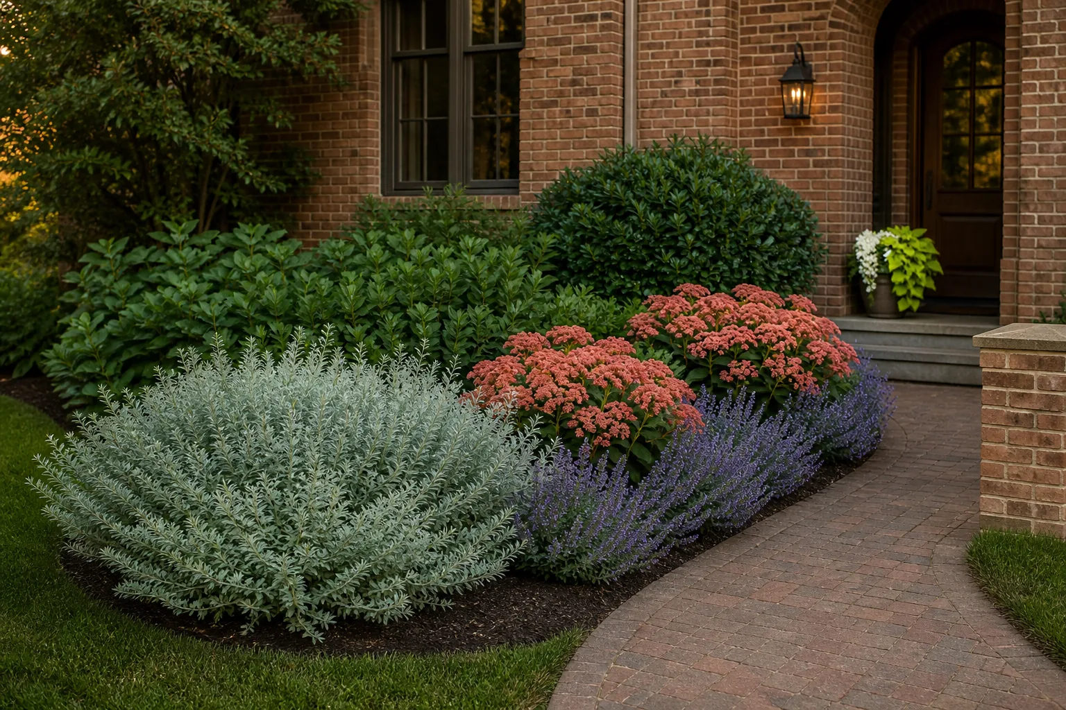
A warm-brick entry bed
The brick and paving are warm, existing shrubs make a deep green field, and the entry needs to feel clear rather than busy.
- 1
Keep the field calm
Let deep green and one gray-green or silver foliage group occupy most of the bed. These colors connect the plants between bloom periods.
- 2
Repeat one lead color
Use a coral or warm rose flowering plant in two or three visible masses rather than sprinkling several unrelated warm colors through the bed.
- 3
Add a smaller cool counterpoint
A restrained lavender or blue-violet repeat can separate the warm flowers from warm masonry without competing with the entry.
- 4
Reserve the brightest accent
Use chartreuse or white near the intended focal point, not evenly around the entire bed.
The exact plants should be chosen for local conditions after the color roles are clear. Proportion and repetition matter more than finding a perfect named shade.
Test the palette beyond peak bloom
Make a quick seasonal ledger before buying. It reveals gaps that a single inspiration photograph cannot show.
Bloom overlap: Confirm when each exact plant typically blooms in your region and whether the colors you intend to pair will be visible together.
Between-bloom structure: Check the foliage, form, and seedheads that remain after flowers fade. Remove any plant that only earns its place for color if the bed lacks structure.
Viewing distance: Use larger repeated color masses where the garden is mainly seen from the street or through a window.
Light conditions: Review the palette in morning, midday, and evening light. Bright colors advance visually; dark colors can recede or disappear in shade.
Plant fit: Verify mature size, light, soil, water, climate, toxicity, and local invasive guidance independently from the palette.
A flower photograph records one moment. A resilient color plan accounts for the rest of the season too.
Frequently asked questions
How many colors should a garden have?
There is no required number, but one lead flower color, one supporting color, and a small accent are easier to repeat coherently than many equal colors. Treat the house, hardscape, and foliage as part of the palette too.
Should garden flowers match the house?
They do not need to match. They should relate to the house through a deliberate harmony or contrast. Start with the undertone of the fixed materials, then test whether the flower palette feels calm or discordant beside it.
How do I keep a colorful garden from looking messy?
Repeat colors in visible groups, let one color lead, and keep enough consistent foliage between the flowers. Clear bed edges and plant masses also matter more than adding another color.
Can I plan garden color when bloom times change by region?
Yes, but verify bloom timing for each exact plant locally. Build the design around foliage and structure first, then use a seasonal ledger to confirm which flower colors will overlap in your climate.
Can Gardenful show different color schemes on my yard?
Gardenful can help you compare planting-led color directions on a clear yard photo. Use the result to evaluate the overall palette, then verify exact plants, bloom timing, and site fit with regional sources.
 Gardenful
See a color direction on your own garden.
Use one clear photo with the house and planting area visible, then compare a focused palette before choosing the exact plants.
Gardenful for iPhone
Download the app free and start with a photo of your yard.

Sources(3)
- [1]
- [2]Elements and Principles of Design
Oklahoma State University Extensionhttps://extension.okstate.edu/fact-sheets/homeowner-garden-design-series-elements-and-principles-of-design
- [3]Landscape Basics: Color Theory
University of Georgia Cooperative Extensionhttps://fieldreport.caes.uga.edu/publications/B1396/landscape-basics-color-theory/